Zero Gravity
Package Design
—01
project brief
—02
my roles
Package Design Graphic Design
—03
the process
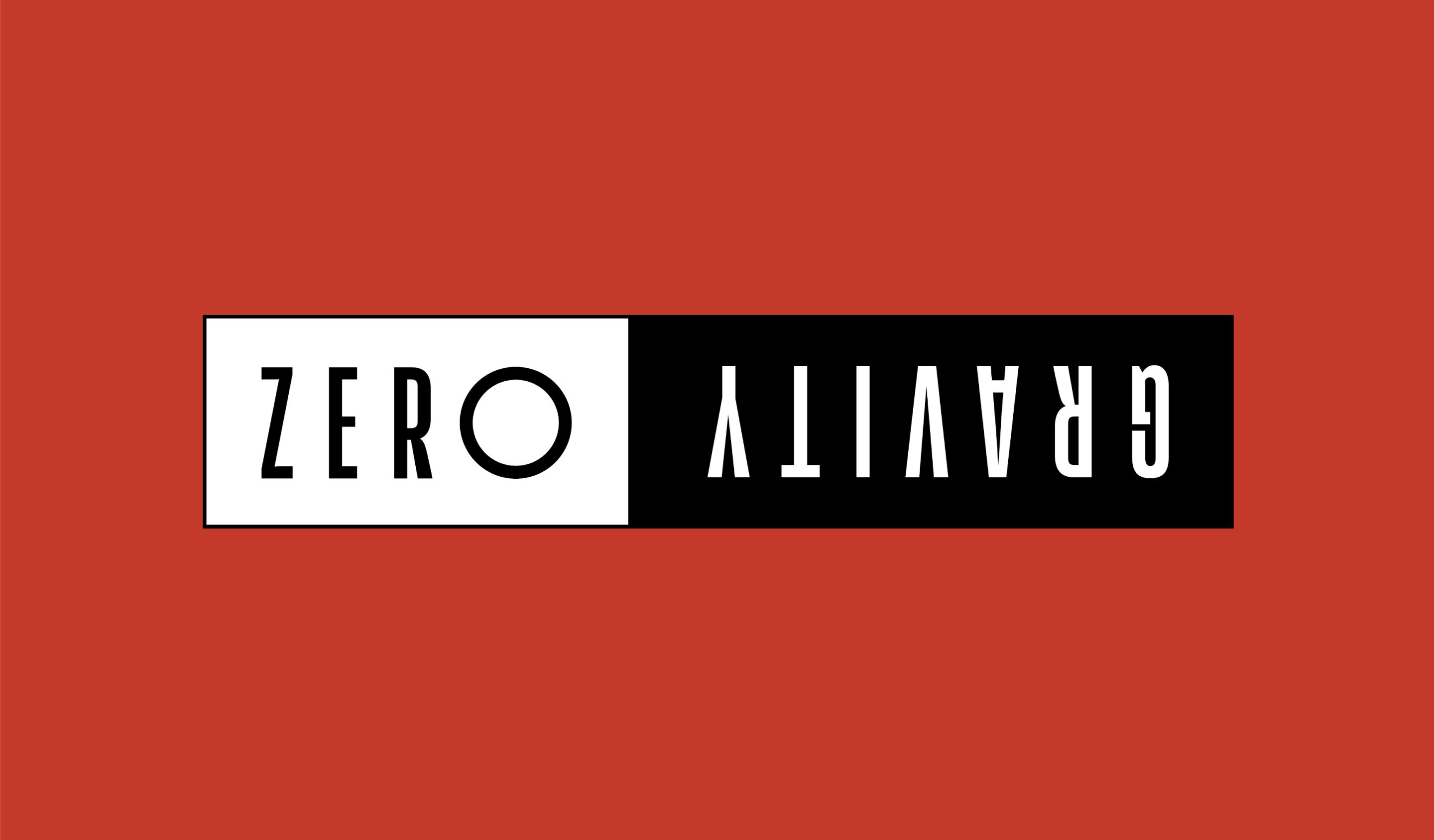
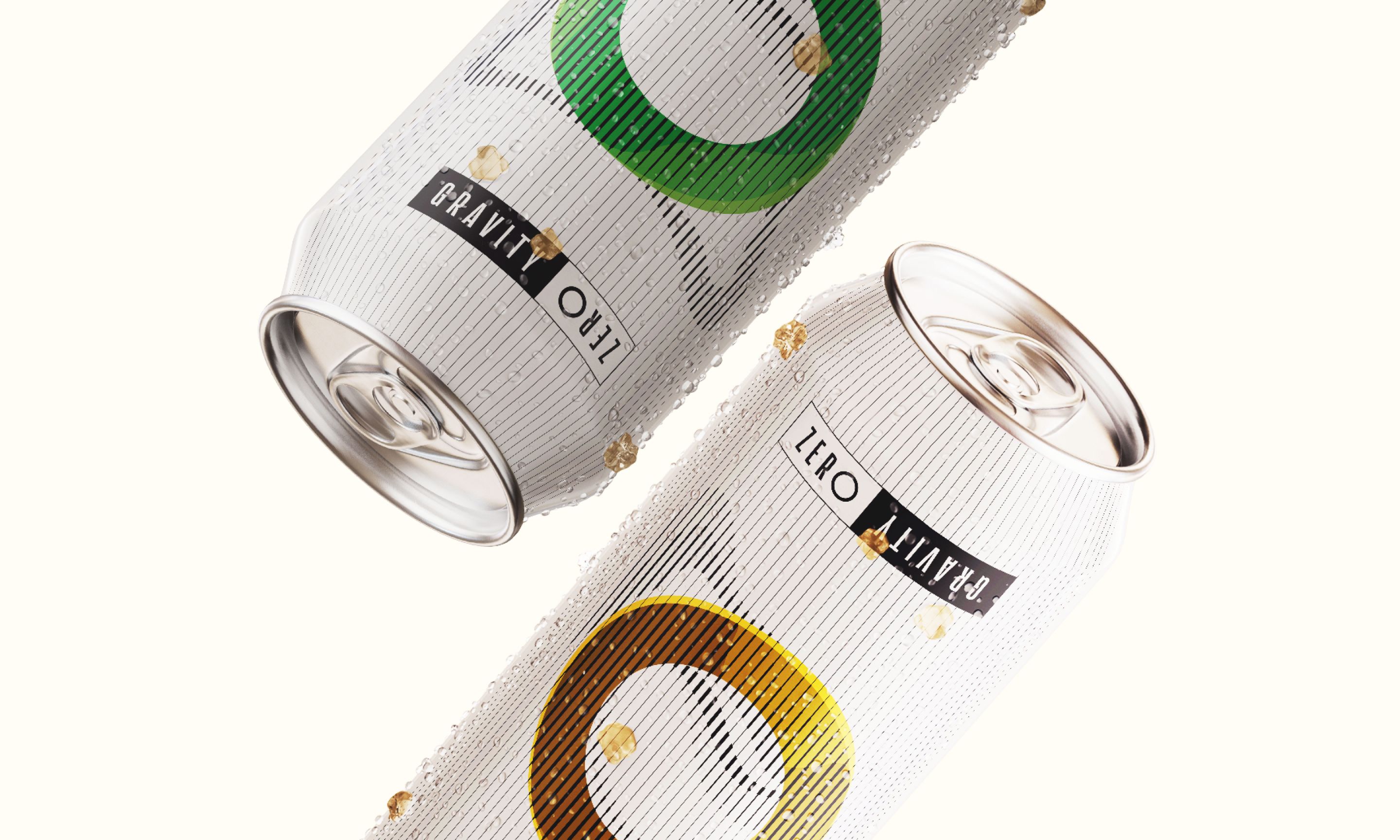
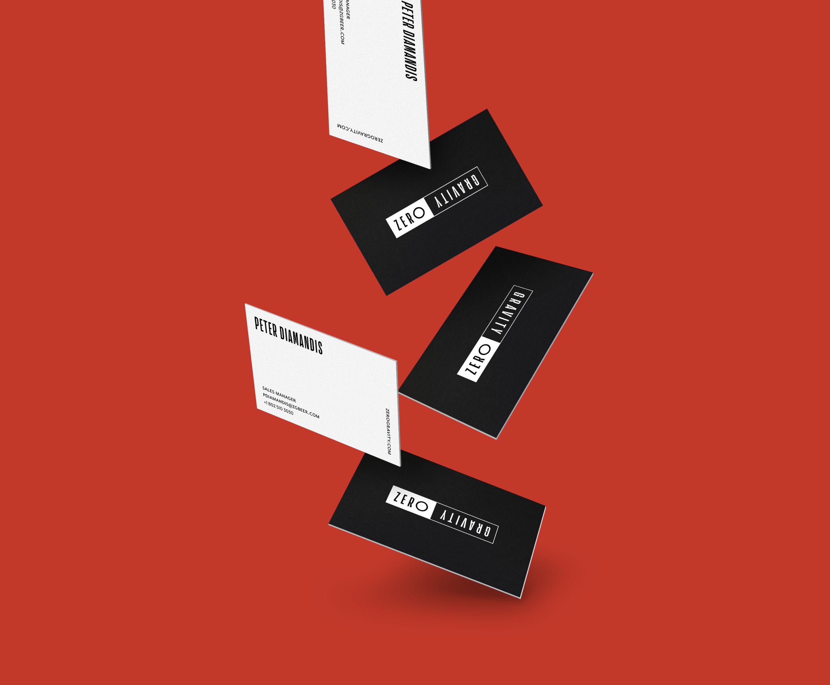
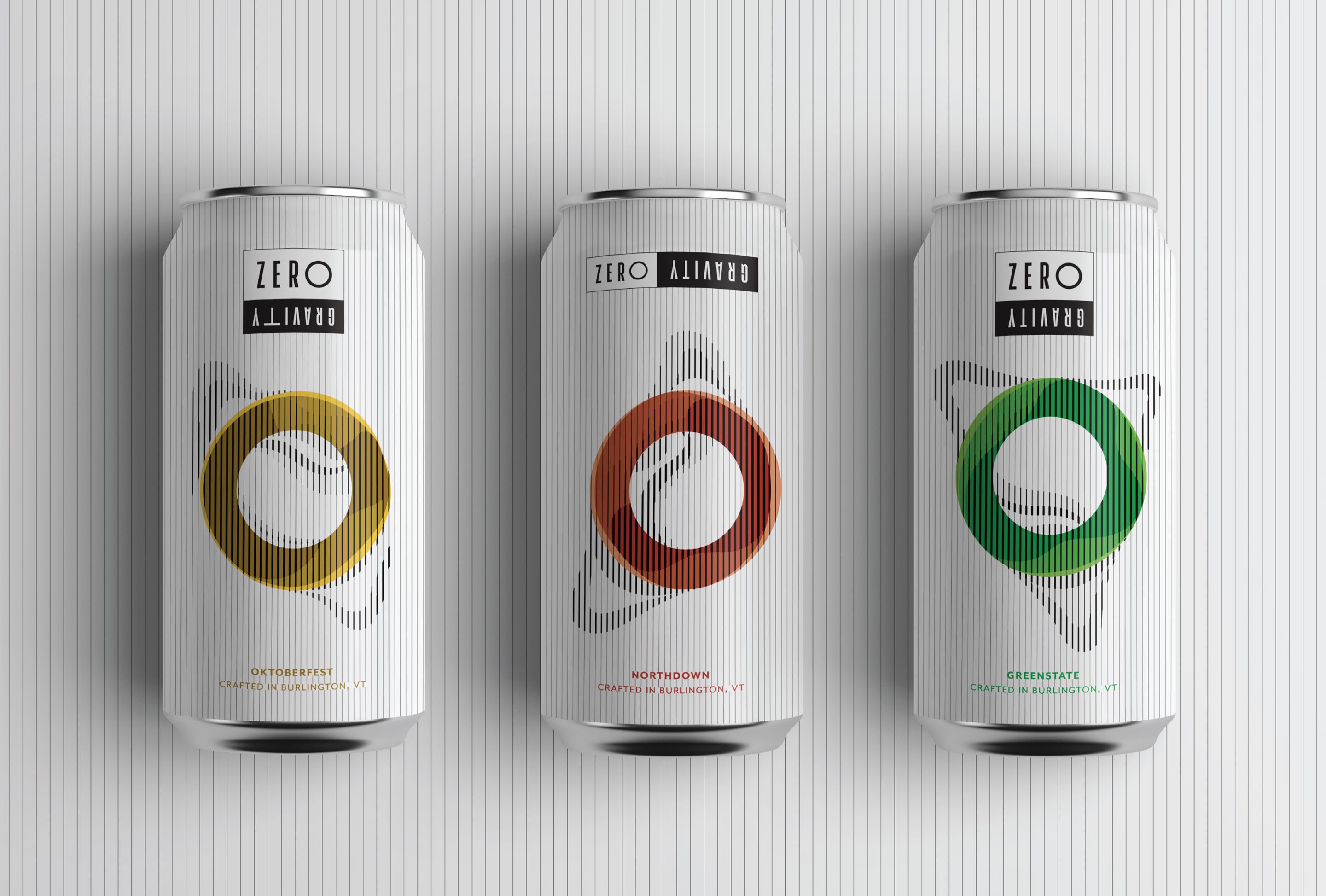
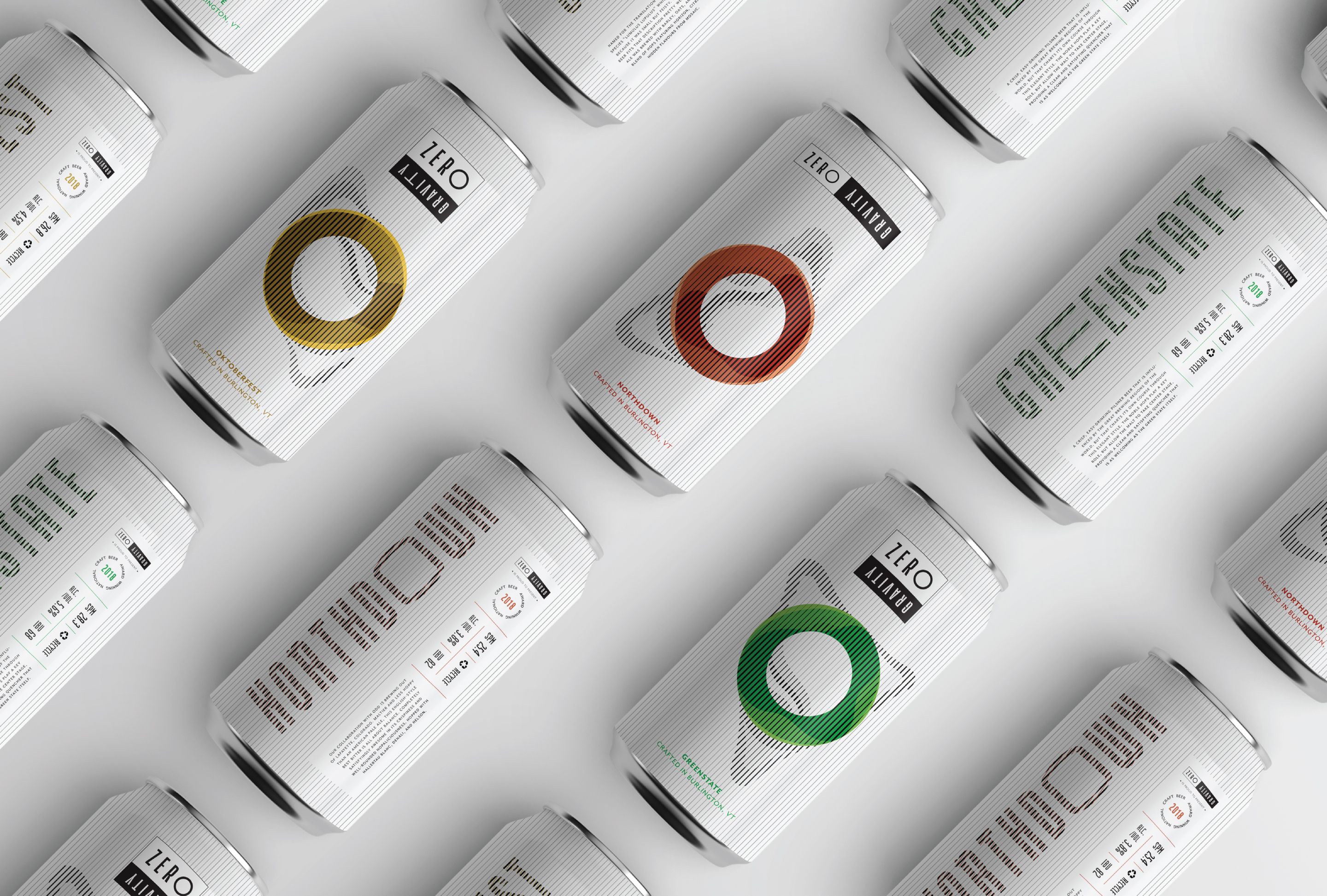
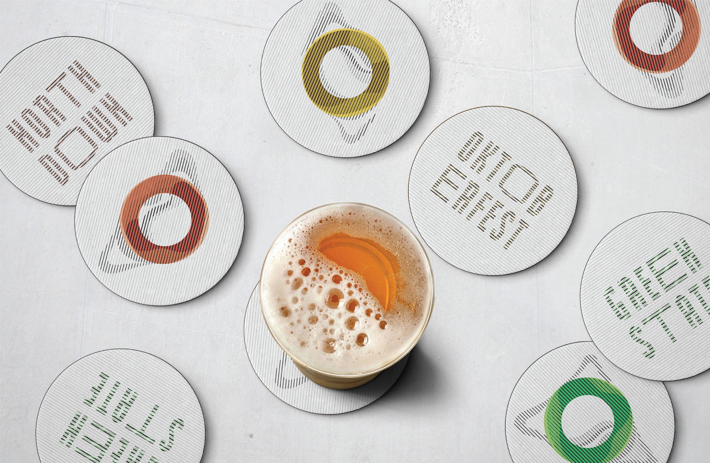
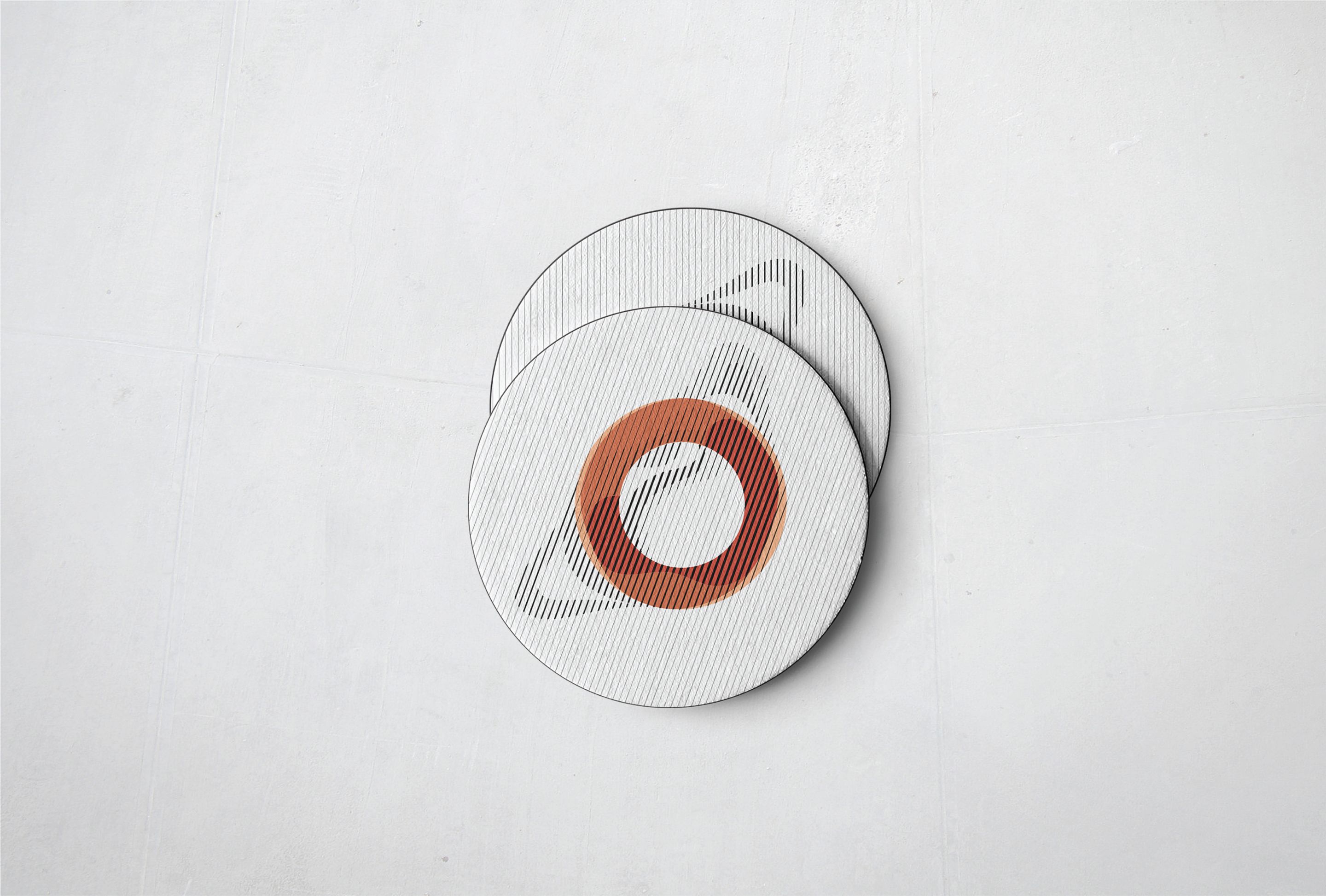
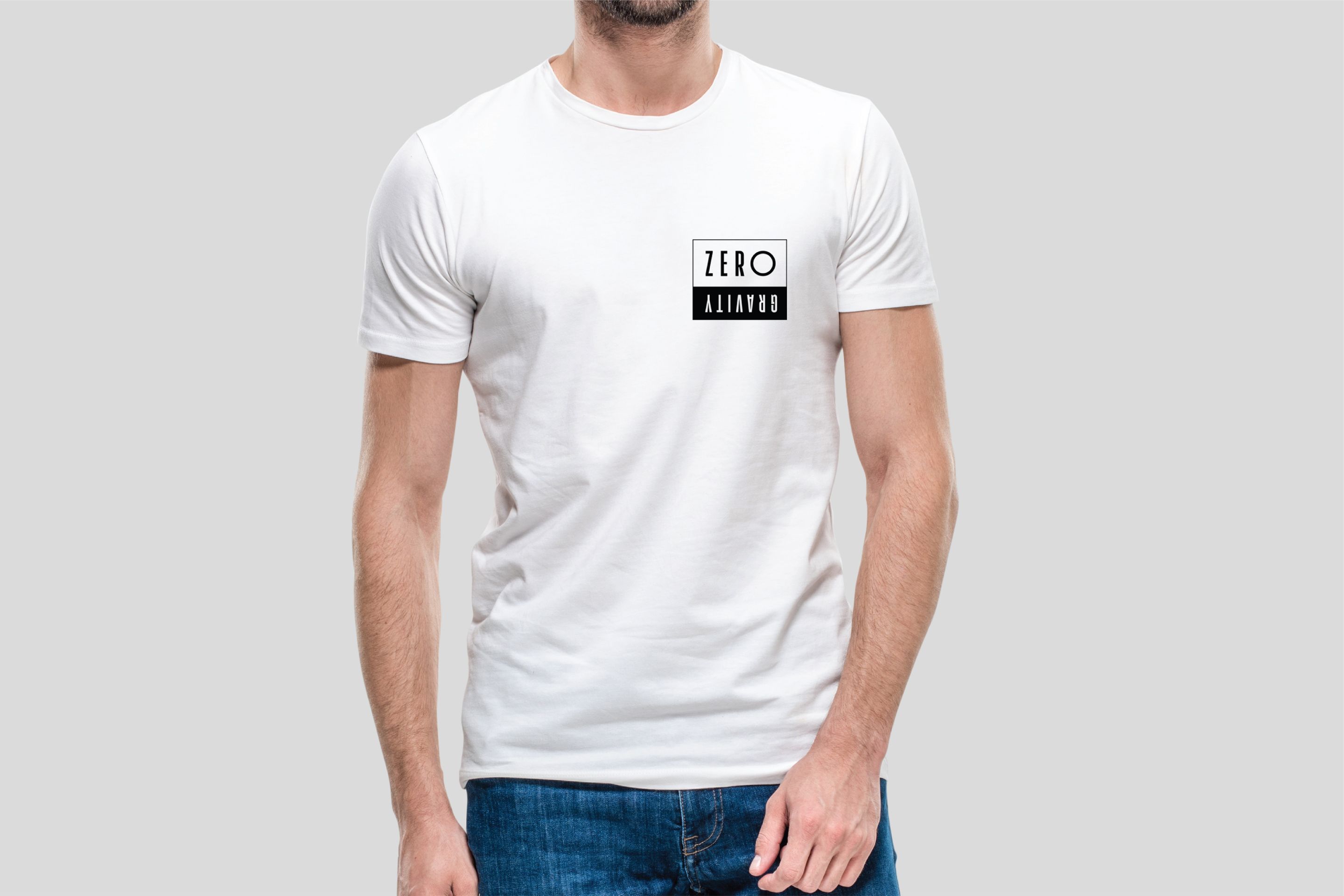
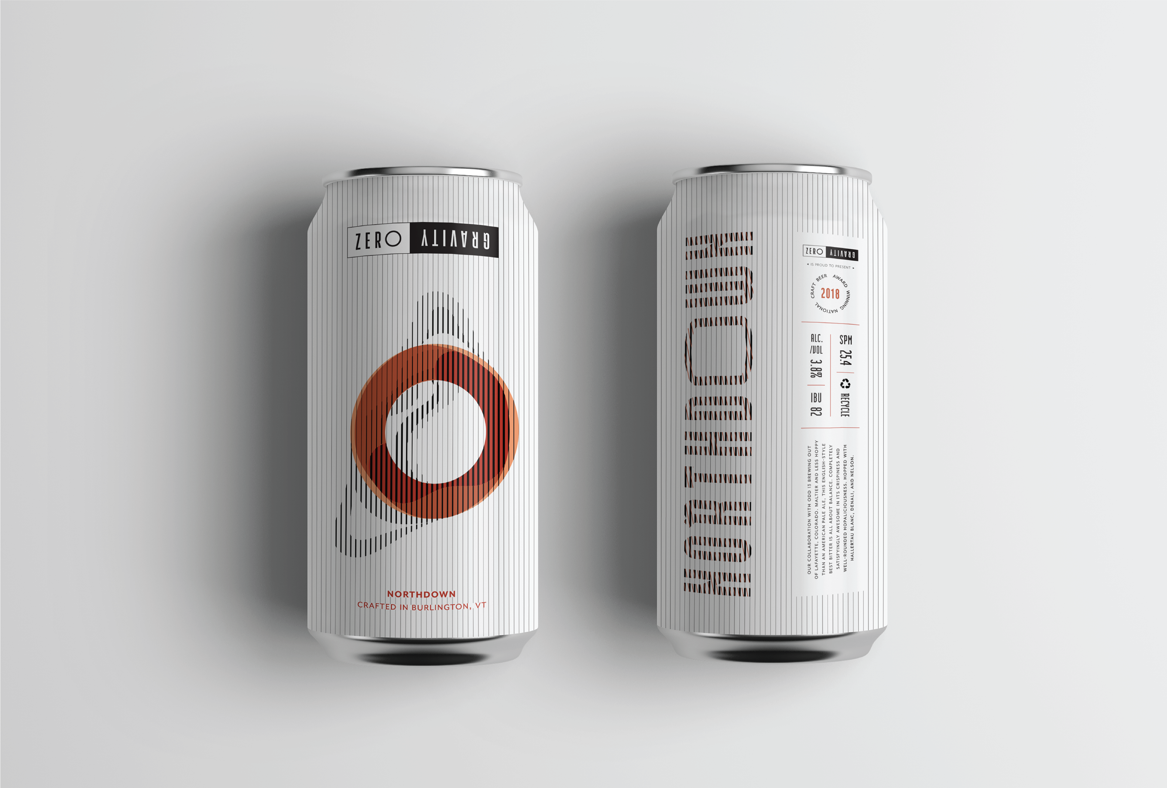
Zero Gravity was a classroom project that aimed at redesigning a national beer company. The iconic colors found during Vermont’s fall and winter seasons—terracota, gold, green and snow-white—inspired me to highlight their scenery through dynamic yet minimal illustrations, with a palette true to the state’s seasons. The system brings to life different aspects of Vermont’s outdoors, staying true to their roots. The dynamic variations of the logo represent the essence of its name, “Zero Gravity”. Its dynamism of the letter forms aims to reflect the concept of a world were gravity is non-existent.